Project
Desktop Web App Dashboard Redesign
Role
UX/UI Designer
Timeline
4 hours
Tools
Figma, ChatGPT, Figma Make
Overview
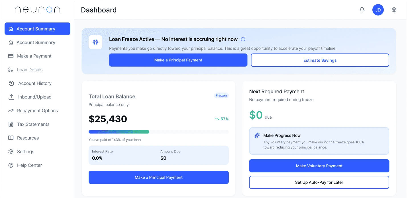
A modern redesign of a student loan portal homepage that communicates clarity, calm, and opportunity. When loans are frozen, users see $0 due but are guided to make principal payments that directly reduce their balance while interest is paused.
In 4 hours, I redesigned the dashboard to deliver instant clarity, emotional reassurance, and optional next steps—supporting both user confidence and business goals.
The Problem
Visually dense
Confusing in hierarchy
Missing a clear explanation of 'freeze'
Hard to parse under stress
Design Challenge
Users needed a calmer, clearer starting point.
Their emotional baseline shaped the design direction.
Understanding the Borrower
Neuron UX Design Challenge: Student Loan Dashboard
"What does 'frozen' mean?"
"Do I owe anything right now?"
"Should I act or wait?"
Design Strategy
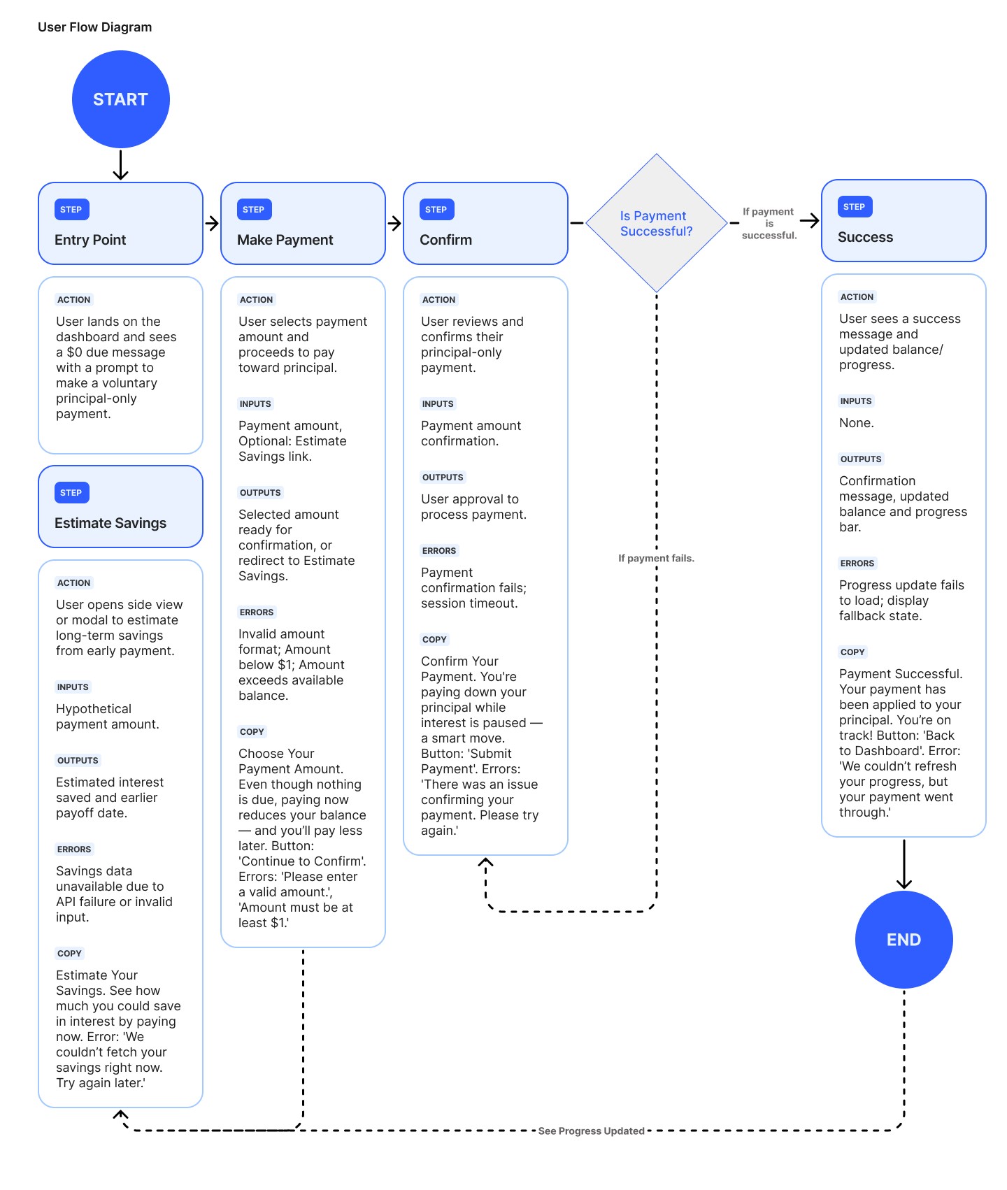
1
Instant clarity
($0 due, freeze explanation)
2
Reassurance
(tone, spacing, hierarchy)
3
Opportunity
(optional principal payment)
4
Progress
(activity + payoff trajectory)
This drove the card layout and UX hierarchy.
Final Redesign (Highlights)
Key Improvements
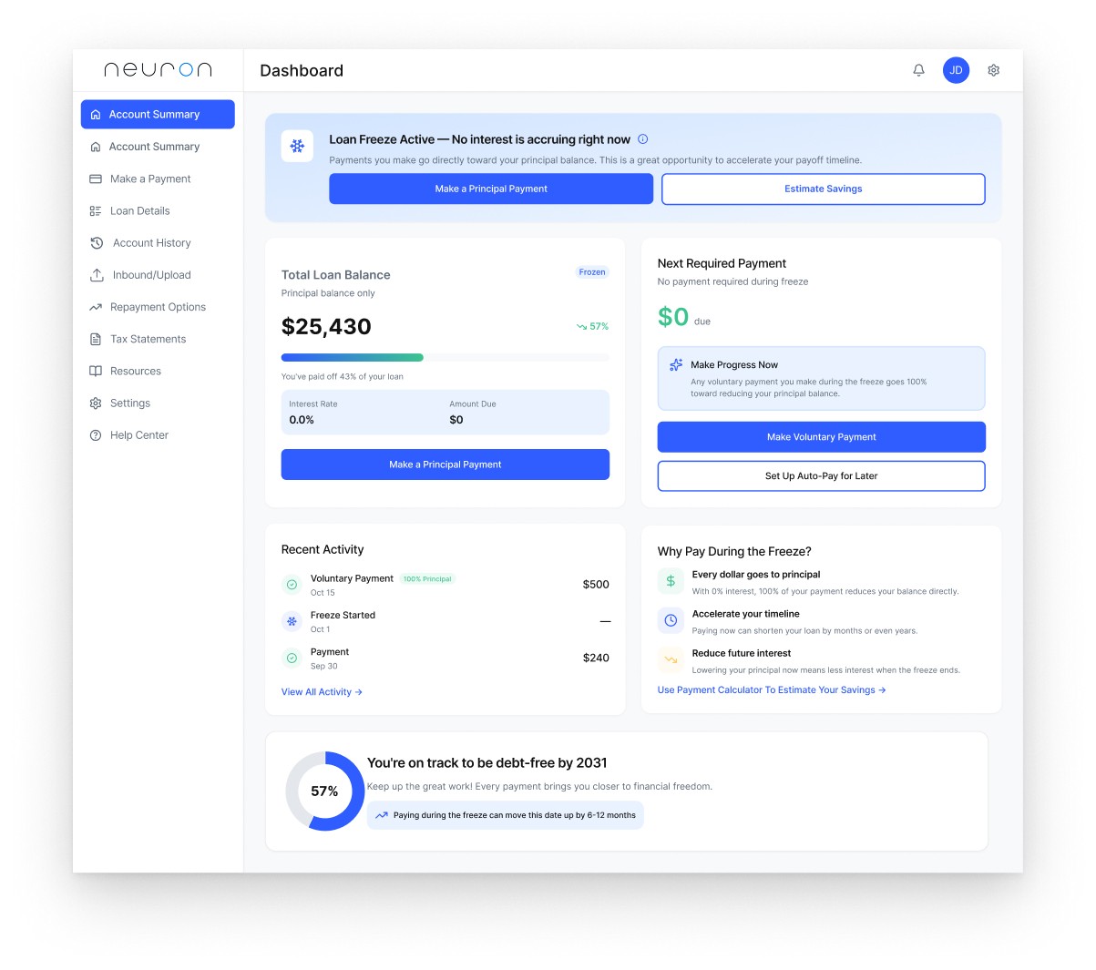
$0 due in primary eyepath
Clear 'Loan Freeze Active' messaging
Calm, modern UI with whitespace
Benefit-focused microcopy
Simple CTA hierarchy ('reassure → educate → invite')
Progress ring to reinforce momentum
How AI Helped Me Deliver in 4 Hours
Used AI for
•
Synthesizing the problem quickly
•
Exploring microcopy directions
•
Accelerating early framing
•
Generating case study structure
Handled manually
•
IA, UI, and visual hierarchy
•
Layout, spacing, and interactions
•
Final tone and design logic
AI sped up the thinking, not the designing.
Assumptions Made
01
Users understand basic loan concepts
02
Reassurance-first hierarchy reduces anxiety
03
Single-screen layout improves comprehension
04
Optional payoff projections increase engagement
05
Data needed for the UI is available
These assumptions guide the next steps.
Future Iterations
Test freeze messaging + CTA hierarchy
Mobile layout
Tools for 'estimate savings'
Personalized payment suggestions
First-time borrower onboarding
Reflection
This challenge reinforced how clarity, emotional awareness, and smart use of AI can elevate financial UX—especially under tight constraints.