
TL;DR
I designed a responsive, mobile-first website that:
Showcases both recording + guitar services with clarity
Highlights gear, credits, and testimonials to build instant trust
Streamlines booking into a fast, mobile-friendly flow
Reflects the gritty, authentic vibe of Pacemaker’s hardcore/DIY roots
[Project Overview]
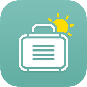
Unpackd is a smart packing assistant that builds tailored lists in seconds—so you spend less time stressing and more time traveling
Problem
Travelers waste time, overpack, and forget essentials because packing tools are either too generic or too much work.
solution
Enter trip details, get a customized list, tweak as needed, and save it for next time—fast, simple, stress-free.
Project Type
Mobile-First Responsive Website
Role
UX/UI Designer, UX/UI Researcher, Interaction Designer, and Brand Designer
Timeline
January 2024- March 2024
Tools
Figma, FigJam, Optimal, ChatGpt, Fatham, Calendy, Zoom, and Google Workspace
Before designing Unpackd, I wanted to step into the shoes (and suitcases) of real travelers — from meticulous planners to last-minute packers — to figure out what makes packing smooth… and what turns it into a chaotic rush.
What’s Already Out There
I dug into PackPoint, Notion's Templates, and Google keep/Apple Notes to see how existing tools help travelers prepare. While they nailed some basics — like weather lookups and reminders — they often lacked flexibility and personality. None hit the sweet spot of smart, context-aware suggestions paired with a fun, motivating checklist experience.


PACKPOINT
NOTION TEMPLATES
GOOGLE KEEP + APPLE NOTES
Conversations from the Road (and Airport Gate)
I spoke with Millennial and Gen Z leisure travelers — frequent weekenders, festival regulars, group-trip planners, and spur-of-the-moment adventurers. Most pack at the last minute but still want the “I’ve got everything” confidence. Today, they’re juggling Notes, weather apps, and group chats — functional but scattered.
Participants made the following observations…
Five themes stood out: visual progress, smart weather integration, quick setup, mood/vibe customization, and reusable templates. These became Unpackd’s guiding lights when shaping features that blend function with fun.
Our North Star Principles
From Research to Clarity
Our competitive scan showed where other tools fell short, and our interviews revealed exactly what travelers crave: a smarter, more personal, and more enjoyable way to pack. The affinity map distilled this into five clear themes — and those became the building blocks for defining Unpackd’s problem statement and core users.
Next, I translated these insights into a clear definition of who we’re designing for — and what problem we’re solving.
With our research themes clear, I translated insights into a focused problem statement and well-defined user profiles — giving Unpackd a sharp target for design decisions.
The Challenge
Travelers want a packing assistant that saves time, remembers essentials, and adapts to their trip details — without feeling rigid or overwhelming. Current tools solve part of the problem, but rarely combine personalization, visual motivation, and flexibility in one seamless experience.
User Goals
Remember all essentials (chargers, meds, outfits)
Reduce packing stress and last-minute anxiety
Customize packing lists by mood, weather, and activities
Visually track packing progress
Coordinate with friends/family for shared trips
Business Goals
Drive repeat app usage across multiple trips
Differentiate via smart contextual features (e.g., weather-based nudges)
Build a visually memorable, emotionally resonant brand
Expand reach via social sharing (shared trip lists, collab modes)
Gather packing trend data for partnerships and future services
Connecting the Dots
The competitive analysis showed functional gaps; the interviews revealed emotional needs. Together, they pointed to an opportunity: create a tool that’s as intuitive and adaptable as the traveler using it.
Who We’re Designing For
Two distinct personas emerged from the research — one thrives on structure, the other on flexibility. Designing for both ensures Unpackd works across different travel styles.
Finding the Sweet Spot
After defining personas, I mapped User Needs, Business Goals, and Technical Feasibility to identify Unpackd’s opportunity space — the overlap where value, viability, and usability align.
From Definition to Design
With our challenge, goals, and target users defined, we moved into ideation — exploring features and flows that could bring Unpackd’s vision to life.
With the problem, goals, and users defined, I began shaping Unpackd — turning prioritized features into flows, wireframes, and a cohesive visual identity.
Prioritizing for Impact
Using the MoSCoW framework, I ranked features based on frequency of need, business alignment, and competitive gaps. This ensured we tackled the essentials first while leaving room for delight.
MoSCoW Feature Set
Must Have – Smart Packing List Generator, Visual Checklist w/ Progress, Weather-Integrated Suggestions
Should Have – Trip Overview Dashboard, Outfit Planning, Item Library, Offline Mode
Could Have – Mood/Vibe Modes, Calendar Sync, Shareable Lists
Won’t Have (for now) – Social Feed, AR Packing, In-app Travel Booking
Mapping Core Journeys
I created user flows for the three most critical actions:
Create a new trip & packing list
Customize the list & save as a template
Add an item to the digital closet
Laying It All Out

Trip Planning (Left)
Purpose: Quickly gather trip basics to streamline packing recommendations.
How It Supports User Goals:
Low effort entry: Minimal fields (trip name, destination, dates) let users jump in without overwhelm.
Contextual input: Travel type options (Solo, Partner, Family) help tailor future packing suggestions.
Progressive disclosure: Keeps the initial task lightweight, delaying more involved decisions until later.
→ Addresses the user need for a quick, low-pressure setup process.
My Closet (Middle)
Purpose: Organize users’ clothing inventory for efficient packing.
How It Supports User Goals:
Filters and categories help users sort by occasion, weather, or color—ideal for indecisive or time-pressed packers.
Visual previews offer confidence and clarity when browsing.
Usage history ("Worn 12 times") adds a personal, data-backed touch for decision-making.
→Supports the goal of simplifying wardrobe management and reducing “what do I even pack?” stress.
Pack From My Closet / Outfit Suggestions (Right)
Purpose: Offer pre-suggested daily outfits based on the trip context.
How It Supports User Goals:
Auto-generated outfits per day reduce decision fatigue.
Weather-based logic ensures outfits are practical for the destination.
Easy add-to-list functionality keeps interaction frictionless and focused.
→Solves for users who want less mental load and more personalized guidance.
Templates Library (Left)
Purpose: Provide users with ready-made or saved templates so they can start a packing list quickly without building from scratch.
How It Supports User Goals:
Jump-start efficiency: Pre-filled templates (Weekend Beach Trip, Family Getaway, Business Trip) reduce decision fatigue.
Personalization cues: Tags (weather, duration, group type) help users match a template to their situation.
Reusability: “Favorites” tab and editing options let users refine and reuse templates across trips.
Scannability: Simple card layout with item counts and context icons makes comparisons fast.
→ Addresses the user need for speed and reusability, turning common packing scenarios into one-tap starting points.
Save as Template (Right)
Purpose: Allow users to save their current packing list as a reusable template for future trips.
How It Supports User Goals:
Customization: Users can name templates to match personal trip patterns (e.g., “Beach Weekend with Kids”).
Transparency: Shows items + categories included, building confidence that nothing is lost.
Reusability: Creates a personal library over time, reducing repetitive packing setup.
Lightweight workflow: Single modal keeps the process quick, in context, and low-effort.
→ Addresses the user need for control and efficiency, letting them invest once and benefit on every future trip.

Testing Before Polishing
Setting the Tone


Before moving to high fidelity, I established the brand identity: a calming yet energizing palette, rounded typography for friendliness, and an approachable logo mark symbolizing organization and movement. This visual system guided every design decision that followed.
From Function to Form
With branding established, I refined designs into hi-fi wireframes — aligning interactions, typography, and colors with Unpackd’s style.
Home Screen
Purpose: Provide a calm, clear starting point.
Personalized greeting adds warmth.
Trip card shows progress at a glance.
Smart alerts (like UV tips) feel useful, not noisy.
Bottom nav mirrors native mobile patterns.
Goal: Reduce decision fatigue with quick context.


Packing List
Purpose: Make packing fast and stress-free.
Checklist is grouped by category for easy scanning.
Edit quantities and notes inline.
Progress bar shows how close you are to done.
Auto-suggestions adapt to trip type and weather.
Goal: Help users pack smarter, not harder.
Save Template Flow
Purpose: Let users reuse packing systems.
Minimal input required—just name, tag, save.
Item preview builds confidence.
Big CTA button keeps it moving.
Goal: Create repeatable lists with zero hassle.


Trip Cards View
Purpose: Browse, reuse, or resume trips easily.
Tags like "Solo" or "Weekend" add context fast.
Progress bars + CTA keep momentum going.
Clear thumbnails and labels help you scan quickly.
Goal: Let users jump back in without friction.
Design System Essentials
Before finalizing Unpackd’s design, I ran moderated usability sessions to see how real travelers interacted with the app — validating our core flows and catching friction early.
Objectives
Evaluate if users understand Unpackd’s purpose from the first screen
Validate clarity of trip creation and list customization flows
Identify points of confusion in navigation and labeling
Gather emotional reactions to tone, visual style, and features
Methodology
Format: Moderated, think-aloud protocol (remote + in-person)
Participants: 5–8 travelers (ages 20–45, mix of planners and last-minute packers)
Prototype: Clickable Figma hi-fi
4 Core Tasks Tested
What We Asked User to Do
What We Learned
Core Concept Clicked Immediately
All users found Unpackd intuitive and valuable — “feels like a real, needed product.”
Language & Layout Tweaks
Changed “Plan your trip” to “Pack for your trip”; right-hand layouts preferred for clarity.
Smart Suggestions Loved
Weather nudges like “Don’t forget SPF” were seen as clever and relevant.
Opportunities for Improvement
Renamed primary action button for clarity
Increased font size for accessibility
Refined icons and early screen labels
Unified checklist style to one-list progress tracking
Prioritized right-side list layouts in final design


Success Metrics
Task Completion: 100% for all core flows
Average Setup Time: ~1 min 15 sec for new trip
Ease-of-Use Rating: 4.7/5 average across tasks
Emotional Response: Words like “organized,” “reassuring,” and “fun” repeated across sessions
Validated and Ready to Launch
With usability confirmed and refinements applied, Unpackd’s core experience was ready for final polish and development. The next step: preparing the MVP for beta testing with real trips.
Unpackd evolved into a polished, responsive app that transforms trip planning into a streamlined, stress-free flow. Here’s how it all came together.


Final UI designs for Unpackd, optimized for mobile-first travel planning.
See how Unpackd guides users from trip setup to packing with progress and control at every step.
“I felt like I was actually getting somewhere—this would save me so much stress before a trip.”
KEY TAKEAWAYS
Smart Features Should Feel Invisible
Personalization adds value
Collaboration in Solo Tasks
Unpackd began as a response to packing stress and decision fatigue. It became a mobile-first travel companion that not only organizes the essentials but makes the process feel calmer and more human.

